


The blue tree won!!! I have to say I’m pretty excited. I love this painting and I really want to showcase it in a special spot. So now for the design.


(If you have no idea what I’m talking about, check out my first post where readers chose the artwork for my office!)
First we have Crisp, Colorful Chic:
Stark white furniture with mirrored fronts give the storage in this room a fun girly flair. The mirror reflects light which is always useful in a working environment. While the painting has a lot of color in it, a colorful rug coordinating with the painting is introduced to ground the design. Orange lacquered chairs and a green lamps pull other colors out of the rug and pop nicely with the white furniture. This design lends itself to being bright, colorful and creative space.

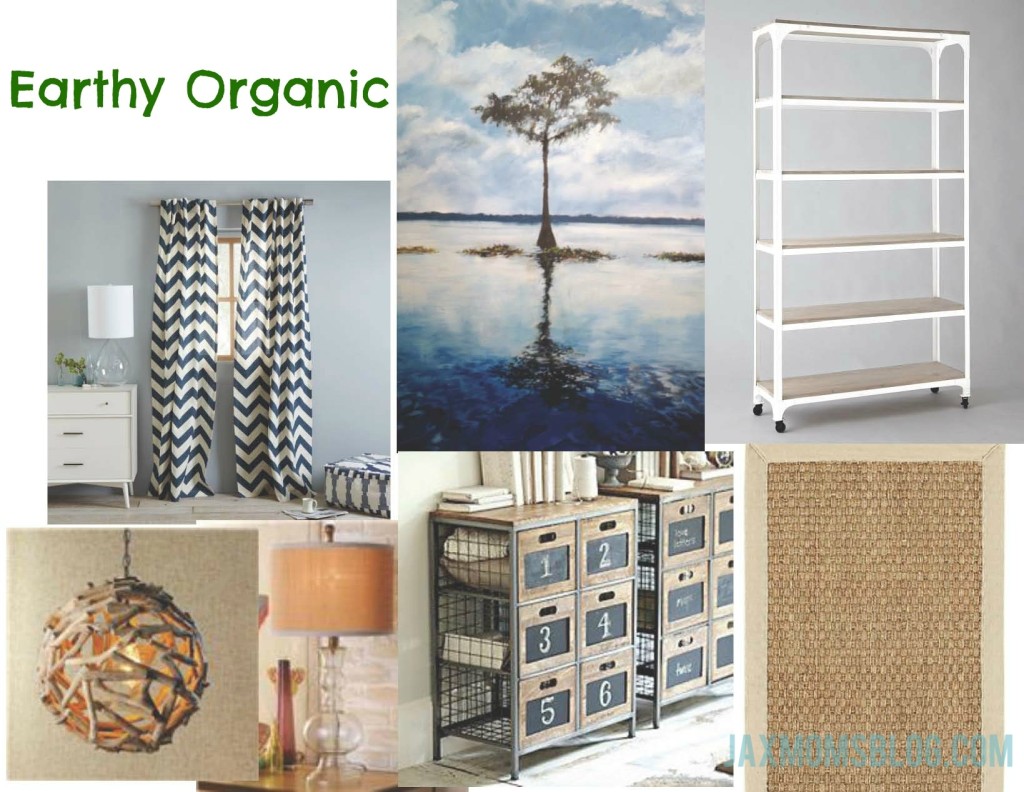
Next we have Earthy Organic Sophisticated:
More wood tones are chosen to coordinate with the lacquered white furniture to introduce a more organic feel. A bentwood chandelier adds texture and light to the room. A neutral rattan rug is used to ground the design. Navy and sand chevron panels will bring out some of the blue in the painting and add a little bit of color to the neutral palette. This design lends itself to being clean and relaxing, an escape.
So what does everyone prefer?
A) Color
or
B) Neutral
Comment below and help me design my office!


Color!
both look great, but I am a color girl!!!
I love the color too!!
I am an earthy organic kind for home decor….like it neutral with SOME pops of color. Also, I get distracted enough as it is so to much color in what is supposed to be a “working environment” would have me even MORE ADD (if that is possible)! haha 🙂 ALTHOUGH, i love the rug in the colorful one but the driftwood pendant light and wood/metal cubbies are what won me over 😉
Color!
Earthy